
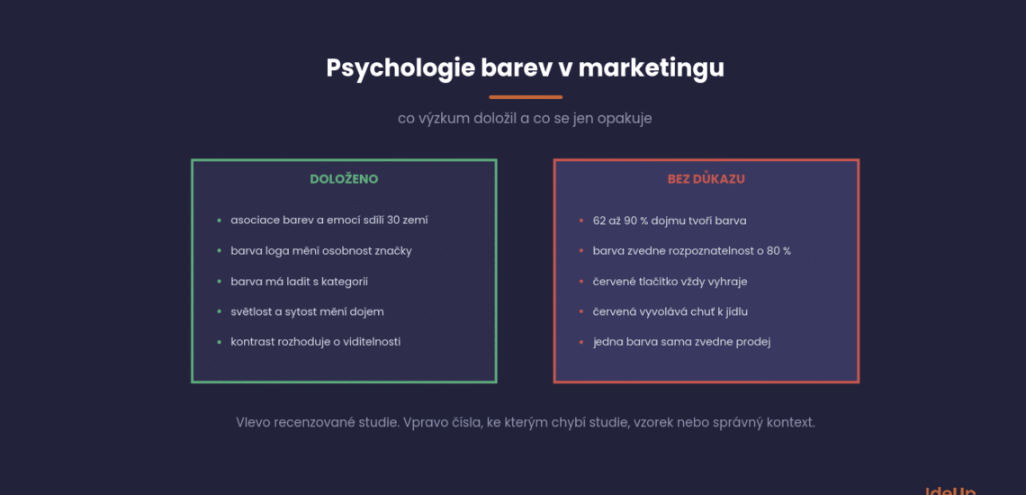
Colour psychology in marketing studies how colour affects what people think of a brand or product and whether they buy it. Research has proven less than the infographics promise. People consistently associate colours with emotions, colour changes a brand’s perceived personality, and contrast determines visibility. There is no evidence that any colour raises sales in general, regardless of the page and its surroundings.
Most figures and rules of thumb about colour have no traceable study behind them. An older version of this page repeated some of them too, for example that red demonstrably stimulates appetite. That is why we rewrote the text from scratch.
What research has actually proven about colour in marketing
Peer-reviewed research supports four things. People associate colours with emotions consistently and similarly across countries. The colour of a logo changes the personality people attribute to a brand. A colour that matches the type of product comes across as more appropriate. And besides hue, lightness and saturation matter.
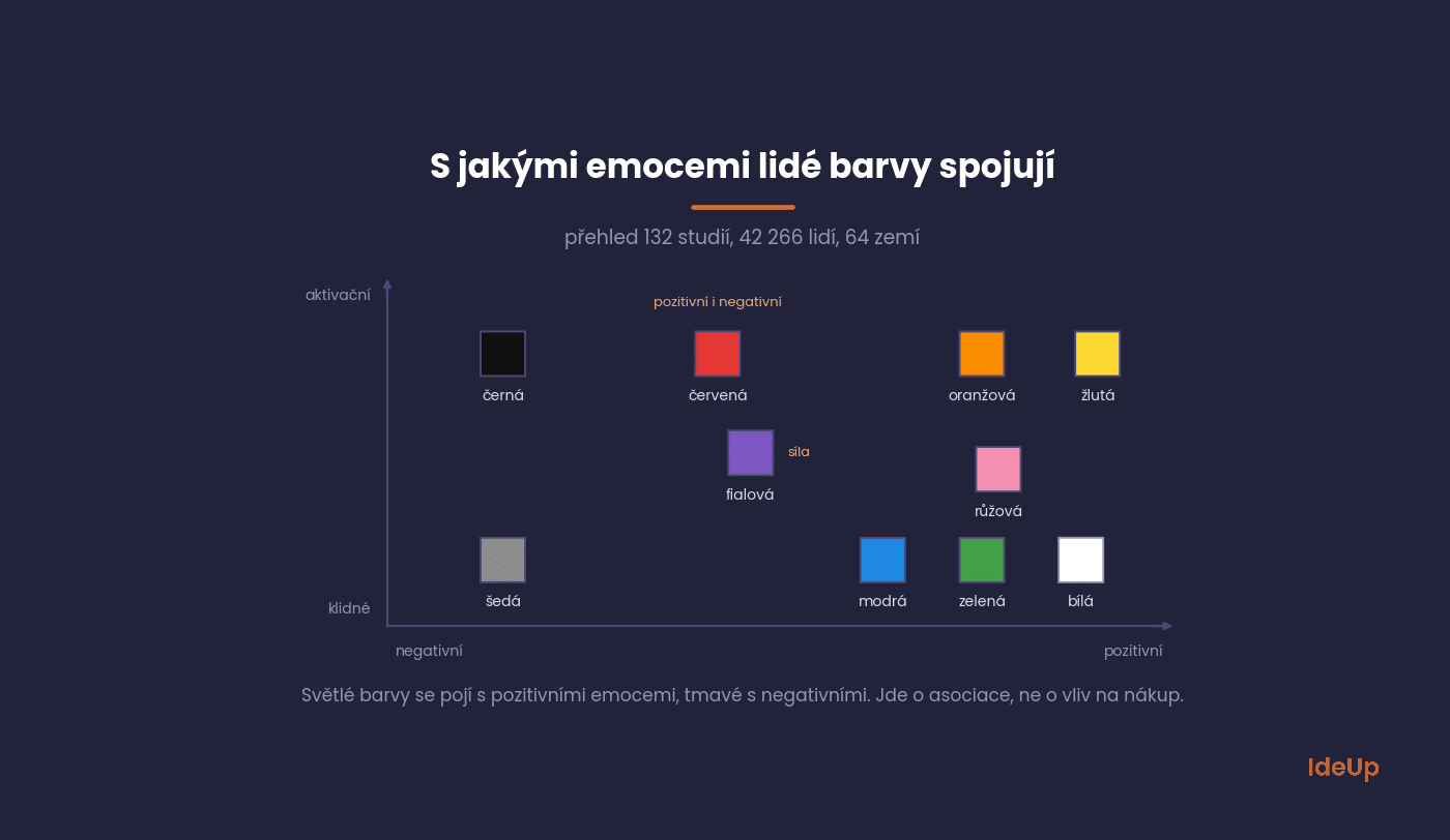
The broadest basis is a 2025 systematic review by Domicele Jonauskaite and Christine Mohr. It summarised 132 peer-reviewed studies with 42,266 participants from 64 countries. In these studies, light colours are linked to positive emotions and dark colours to negative ones. However, the authors point out that most studies measured associations, that is, what we link a colour with, not whether the colour actually triggers the emotion.
For brands, the most cited work is by Lauren Labrecque and George Milne from 2012. In four studies with logos, they showed that red increases the impression of excitement and blue the impression of competence, meaning reliability, intelligence and success. Saturation and lightness strengthen or weaken this signal. In their data, colour influenced purchase intention mainly indirectly, through the personality people attribute to the brand.
Two older studies add context. Paul Bottomley and John Doyle (2006) found that products bought for utility seem more appropriate in functional colours such as blue, and products bought for the experience in sensory colours such as red. Gerald Gorn and colleagues (1997) showed that a lighter colour in an advertisement relaxes people and a more saturated one excites them. Both increase how much people like the advertisement.
How the psychology of colour in marketing and branding works
Colour works through associations people have learned, not through a fixed reaction in the brain. You link a colour with what you have repeatedly seen it on, such as nature, warning signs, uniforms or the products of a particular category. When a brand uses a colour, it borrows part of these associations and, over time, adds its own.
Three things shape how a colour is read. The first is the person’s experience and culture. The second is the context, meaning the product, the message and the colours around it. The third is the colour itself, including its hue, lightness and saturation. The same dark green can look premium on a whisky label and dull on a children’s toy.
For branding, consistency matters more than the choice itself. A colour becomes a recognisable part of a brand only when you use it in the same way on your website, packaging, advertising and documents for a long time. If you change the palette with every campaign, people never learn to connect it with you.
Colour figures repeated without evidence
The most frequently cited figures about colour have no traceable study, or they come from a different context. The claim that colour accounts for 62 to 90% of a first impression is spread by a review article that attributes it to a commercial institute with no published methodology. The red button with 21% more clicks is a single test on a single page. We do not recommend using them as arguments in a presentation.
| Claim | Where it comes from | What is really behind it |
|---|---|---|
| Colour accounts for 62 to 90% of the first impression of a product | Singh (2006), Management Decision | A literature review, not an experiment. The figure is attributed to the commercial Institute for Color Research. The methodology, year and sample are not published. |
| Colour increases brand recognition by 80% | “a Loyola University study” | The studies we traced examined colour in charts and text, not brands. The figure appears in a 2005 Xerox marketing leaflet. |
| A red button converts 21% better | HubSpot blog (2011) | A single test on a single page with a green logo. The result is explained by contrast with the surroundings, not by red. |
| Red stimulates appetite | Marketing websites, including an older version of this text | A 2012 study titled The color red reduces snack food and soft drink intake found the opposite in its experiments. A follow-up study showed that it depends on how healthy the food appears. |
All four figures came from a specific situation, and as they passed from article to article, the conditions disappeared. What remained is a sentence that is easy to quote and impossible to verify.
If an agency or a tool presents you with a percentage about the effect of colour on sales, ask for the study, the year and the sample. If no answer comes, keep the figure out of your decisions.
What individual colours mean in marketing
The meaning of a colour can only be described as its most common associations, not as a rule. According to the review of 132 studies, people associate blue and green with calm positive emotions, yellow and orange with energetic ones, red with strong emotions both good and bad, and grey with negative ones. What this means for a specific brand depends on the category and the competition.
| Colour | What people most often associate it with (review of 132 studies) | Where it is often used in marketing | What to watch out for |
|---|---|---|---|
| Red | strong emotions, love and anger, strength | discounts, food, bold brands | high arousal can come across as a warning |
| Orange and yellow | joy, energy | alerts, friendly brands | white text on them lacks sufficient contrast |
| Blue | calm, competence, reliability | finance, technology, B2B | if the whole industry uses it, it will not set you apart |
| Green | calm, positive mood | eco-friendly, health and natural products | without substantiated claims it looks like greenwashing |
| Purple and pink | strength (purple), positive emotions (pink) | cosmetics, creative brands | the impression depends heavily on hue and saturation |
| Black | negative and intense emotions | fashion, luxury, technology | on its own it carries rather negative associations and needs context |
| White and grey | white: calm; grey: negative and subdued emotions | backgrounds, minimalist design | in China, Japan and Korea, white is traditionally the colour of mourning |
The table shows an average, not your customers. Colours affect everyone slightly differently, depending on their experience and what they encounter in the industry. Blue suits a bank because a bank sells reliability. Chocolate is bought for the experience, so according to Bottomley and Doyle, a warm sensory colour suits it better than blue.
That is why colour comes only after the question of what the brand should promise. Those who start with a palette choose by taste. Those who start with the brand’s personality choose the colour and the logo according to what they need to carry.
The psychology of colour blue in marketing
Blue is a common choice for banks, insurers, software companies and B2B services. Its advantage is that it rarely puts anyone off and fits a promise of reliability. Its disadvantage follows from the same fact. When most of your competitors are blue, a blue brand looks safe but interchangeable.
If blue fits your brand, you can still stand out within it:
- Choose a less common shade, such as a very dark navy or a lighter, more saturated blue.
- Pair blue with a distinctive accent colour for buttons and highlights.
- Let typography, imagery and tone of voice carry the personality, so colour does not have to do all the work.
Before you decide, put your logo next to the logos of your five closest competitors. If you cannot tell them apart at a glance, the colour is not helping you.
No button colour converts better universally. What matters is whether the button stands out from the rest of the page and whether its text is legible. An orange button on an orange website blends in, while the same button on a blue website stands out. It makes sense to watch the contrast with the surroundings, not to look for a winning colour.
The test that gave rise to the red myth illustrates this well. It was described by the HubSpot blog in 2011 and ran on the page of the company Performable. The company had a green logo and a lot of green in its graphics, so the red button stood out more than the green one and received 21% more clicks. The result applies to that one page and cannot be transferred to a website with different colours.
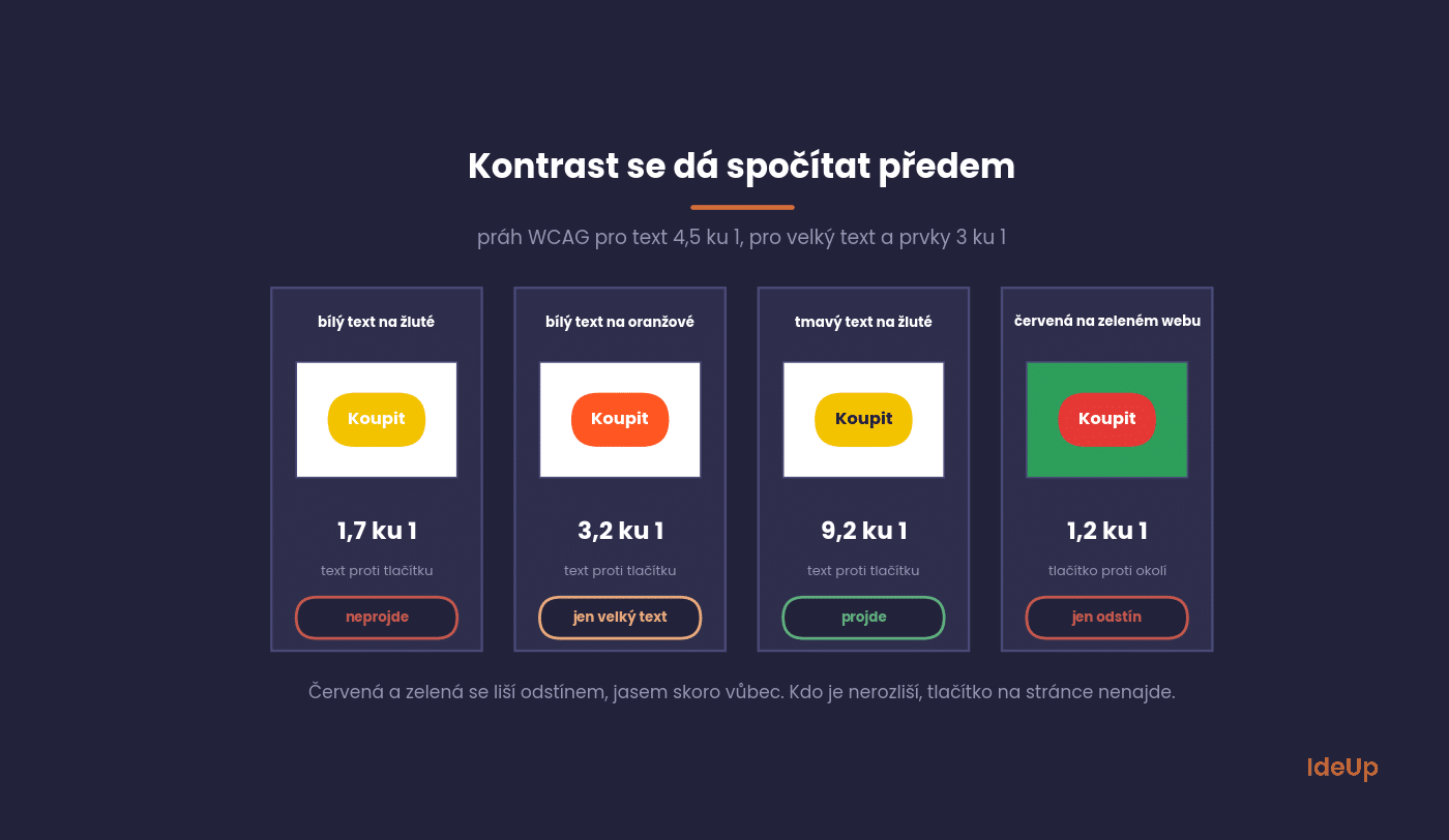
Red and green differ mainly in hue, not in luminance. Using the WCAG formula, we calculated a contrast ratio of 1.2 to 1 between a standard red (#E53935) and green (#2E9E5B). For a person with red-green colour vision deficiency, such a button may blend into its surroundings. Roughly one in twelve men and one in two hundred women have a colour vision deficiency.
Moreover, colour is not the first thing to test on a button. What happens after the click and how the call to action is worded matter more, as we explain in the CTA entry. Test colour only after that, with an A/B test and enough visits.
Colour contrast and accessibility under WCAG
The WCAG accessibility standard requires a contrast of at least 4.5 to 1 against the background for normal text. For large text, from roughly 24 pixels or 18.5 pixels in bold, 3 to 1 is enough. For buttons and form fields, whatever identifies the element, such as the field border or an icon, must have at least 3 to 1. Text that is part of a logo has no requirement. You will find the exact wording of the criteria in the W3C documentation on contrast.
In practice, more combinations fail than you might think. White text on saturated orange (#FF5722) has 3.2 to 1, and on yellow (#F2C200) only 1.7 to 1. Dark text on the same yellow has 9.2 to 1.
WCAG also states that colour must not be the only carrier of information. An error in a form marked only with a red border is not enough. It also needs text or an icon.
For e-shops, this is not just good practice. Act No. 424/2023 Coll., on Accessibility Requirements (zákon o požadavcích na přístupnost), has been in effect since 28 June 2025 and also covers e-commerce services. Micro-enterprises with fewer than ten employees and a turnover or balance sheet total of up to 2 million euros are exempt. Supervision is carried out by the Czech Trade Inspection Authority (Česká obchodní inspekce).
How the meaning of colours differs between cultures
Colour-emotion associations are largely shared. A 2020 study by Domicele Jonauskaite and colleagues with 4,598 people from 30 countries measured an average similarity of associations of 0.88 on a scale up to 1. Differences do exist, however, and they grow with linguistic and geographical distance. In Slovakia or Poland, you can therefore expect smaller differences than in Asia.
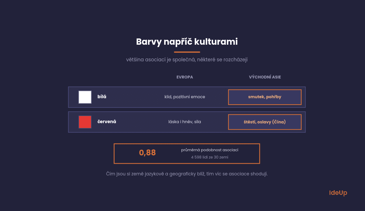
The best-known differences concern white and red. In China, Japan and Korea, white is traditionally the colour of mourning and funerals, while in China red is linked to happiness and celebrations. Thomas Madden and colleagues (2000) found patterns of both similarity and difference in colour preferences and meanings across eight countries.
This leads to a practical rule for marketing. In nearby markets, check the colours of the local competition. In distant markets, show your logo, packaging and homepage to people from the target country before you launch a campaign. A few interviews will not replace research, but they will reveal a serious mistake.
Where to start with your brand
The colours of a brand and website can be chosen systematically. The process we use at IdeUp has four steps, and none of them starts with the owner’s favourite colour.
- Start with your brand’s personality. Write down three qualities the brand should convey, and look for a colour that matches them.
- Review your competitors’ colours. When the whole industry uses blue, a different colour will set you apart more than a better shade of blue.
- Check contrast before you approve the design. Text 4.5 to 1, buttons 3 to 1, and never convey information through colour alone.
- Test button colour only after the copy and placement, and judge it by sales, not clicks.
Colour alone will not save a page that fails to explain what you offer. If you want to raise your website’s conversion rate, start with the content and structure and fine-tune the colours last. If you like, we can go through colours, contrast and buttons with you as part of designing or updating your website.
Common mistakes with colour in advertising and marketing
- Too many colours. When everything is highlighted, nothing stands out. A main colour, one or two supporting colours and one accent for actions are usually enough.
- Copying the market leader. If you take the leader’s colour, you risk looking like a cheaper alternative to it.
- No exact colour values. Define precise values for screens and for print, so your brand looks the same on a website, a banner and a printed brochure.
- Changing colours in campaigns without a reason. Every departure from the palette weakens the link people make between the colour and your brand.
- Forgetting dark backgrounds and small sizes. Check that your logo and buttons stay legible in dark mode and at small sizes, such as a browser tab icon.
Frequently asked questions about the psychology of colour in marketing
What is the psychology of colour in marketing?
It is the study of how colour shapes what people think and feel about a brand or product and whether they choose it. It works mainly through learned associations and through the personality people attribute to a brand. The effect always depends on the context, the product category and the colours around it.
What does blue mean in marketing?
Blue is most often associated with calm, competence and reliability, which is why it is popular in finance, technology and B2B. Because so many brands in these industries use it, blue alone rarely sets you apart. A distinctive shade or a strong accent colour can help.
How is colour psychology used in advertising?
Advertisers use colour to match the mood of a message, to make the product and the call to action stand out, and to keep the brand recognisable across campaigns. Lighter colours tend to feel calmer and more saturated ones more exciting. Contrast with the surroundings decides what people notice first.
Does the psychology behind colours in marketing really work?
Colour reliably influences associations and the impression a brand makes, but no colour increases sales on its own. It works as part of the whole design, together with the offer, the copy and the layout. Treat colour as a way to support your brand’s message, not as a shortcut to more customers.


Leave A Reply