A landing page is a page built for one action. Visitors arrive from an ad or an email and are meant to do one thing: send an enquiry, buy or download something.
Most of what companies call a landing page, however, is not really a landing page. It is a subpage of the website with a form at the bottom and the full menu at the top.
This article explains how the two differ, which building blocks make up a good landing page and when you do not need one.
How it differs from a regular page
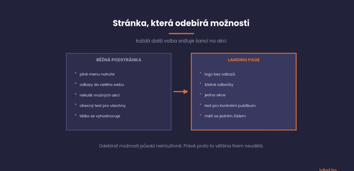
A regular website page is meant to offer options. A landing page is meant to remove them, because every extra choice lowers the chance that the visitor takes the one action that matters.
In practice, this means a smaller menu or none at all, one goal and no detours. Most companies skip this part because it feels counterintuitive.
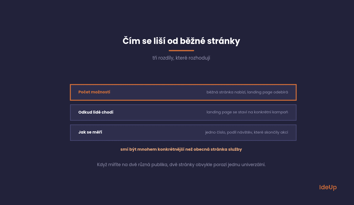
The second difference is where visitors come from. A landing page is built for a specific campaign and a specific audience, so it can be far more specific than a service page.
The third difference is measurement. On a landing page, you track a single number: the share of visits that ended in the action. This is much harder to assess on a regular page.
What it is made of
The structure that works changes little from one industry to another. The following six blocks cover most cases, and the order matters more than it seems.
You do not have to use all of them, but the first two and the last one are essential.
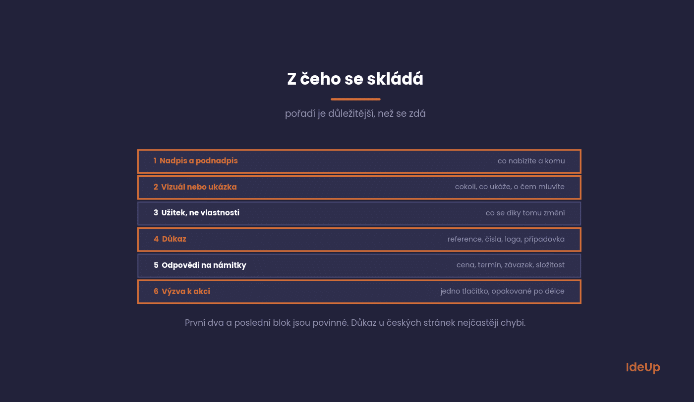
Headline and subheadline
The headline says what you offer and to whom. The subheadline adds how it works or who it is for.
The most common mistake is a headline that talks about you instead of the visitor. The test is simple: if someone landed on the page without any context, would they understand within five seconds what to do?
Visual or demo
A product photo, a screenshot of the tool, a short video. Anything that shows what you are talking about.
Stock photos of smiling people at a computer do not do this job. They show nothing, and readers skip them.
Benefits, not features
Three to five points about what the visitor gets out of it. Not what the product can do, but what changes as a result.
Take the wording from conversations with customers. A description you come up with in a meeting speaks a different language from the person who is supposed to buy.
Proof
Testimonials, figures, client logos, a case study. This is the block most often missing from Czech companies’ pages, and the one whose absence hurts most.
Small things work too. One specific figure from a project does more than three generic, anonymous compliments.
Answers to objections
What puts people off and why it is not a problem. Price, delivery time, commitment, complexity.
These points come from sales. Ask where deals most often fall through and answer that directly on the page.
Call to action
One button, one action, repeated two or three times along the page. The button text should describe the outcome, not the step.
The difference between a “Submit” button and an “I want a no-obligation quote” button is small in writing and measurable in results.
Landing page examples by goal
The anatomy stays the same, but the page changes with the action you want. These are the most common types you will come across.
- Lead generation page. A form for an enquiry, a quote or a consultation. Typical for services and B2B.
- Click-through page. No form, just a button that leads to the next step, such as a checkout or a free trial sign-up.
- Event or webinar registration. Date, programme, speaker and a short form.
- Content download. A guide or checklist in exchange for an email address.
- Waitlist page. For a product that is not on sale yet, with one field for an email.
A simple example of a lead generation page: an accounting firm advertising payroll services. The headline names the audience, such as companies with 20 to 200 employees. Below it sit three benefits, one client testimonial with a specific result, a short answer to the question of switching providers mid-year and a form with three fields. Nothing else.
The form and how much to ask
Every extra field reduces the number of submissions. At the same time, a form that is too short can bring in enquiries that are of no use.
The right balance depends on what you do with the enquiry next.
If you follow up enquiries by phone, a name, a phone number and one question to help with sorting are enough. You will find out the rest on the call.
If you handle enquiries by email and want to send a quote straight away, you need more, but then explain on the page why you are asking.
A practical rule that works well is a maximum of four fields for the first contact. Deal with the rest in follow-up communication.
How to build a landing page step by step
- Define one goal and one audience. If you cannot describe both in a single sentence, the page will try to do too much.
- Match the message to the source. The headline should repeat the promise of the ad or email that brought the visitor. A mismatch makes people think they are in the wrong place.
- Write the text before the design. Layout should serve the content, not the other way round.
- Design for the phone first. Check that the headline and the button are visible without scrolling on a small screen.
- Test the whole path. Submit the form yourself and check that the enquiry arrives and the thank-you page works.
Landing page design choices that help
Good design here is about guiding the eye, not decoration. A single column is easier to follow than several side by side. The button should be the most visible element on the screen, with a colour that appears nowhere else. Leave enough white space around key blocks and keep text large enough to read on a phone without zooming.
When you do not need a landing page
It is not a universal solution, and in some cases it is extra work with no benefit.
Three situations where it is better to invest elsewhere.
You have no campaign. A landing page without a traffic source is a page nobody visits. Channel first, page second.
You sell from a catalogue. For an e-shop with thousands of products, category and product pages do the job of a landing page. That is where investment pays off.
You have a service page that works. If a page already converts, there is no reason to build a second one. It is better to improve the one you have.
Unbounce, which has specialised in landing pages for a long time, says the same in its basic definition. What matters is one action and removing distractions, not the technology.
How to evaluate it
For a landing page, you track one main number and three supporting ones. More metrics mean you get lost.
Set them up straight away, otherwise you will have nothing to compare against.
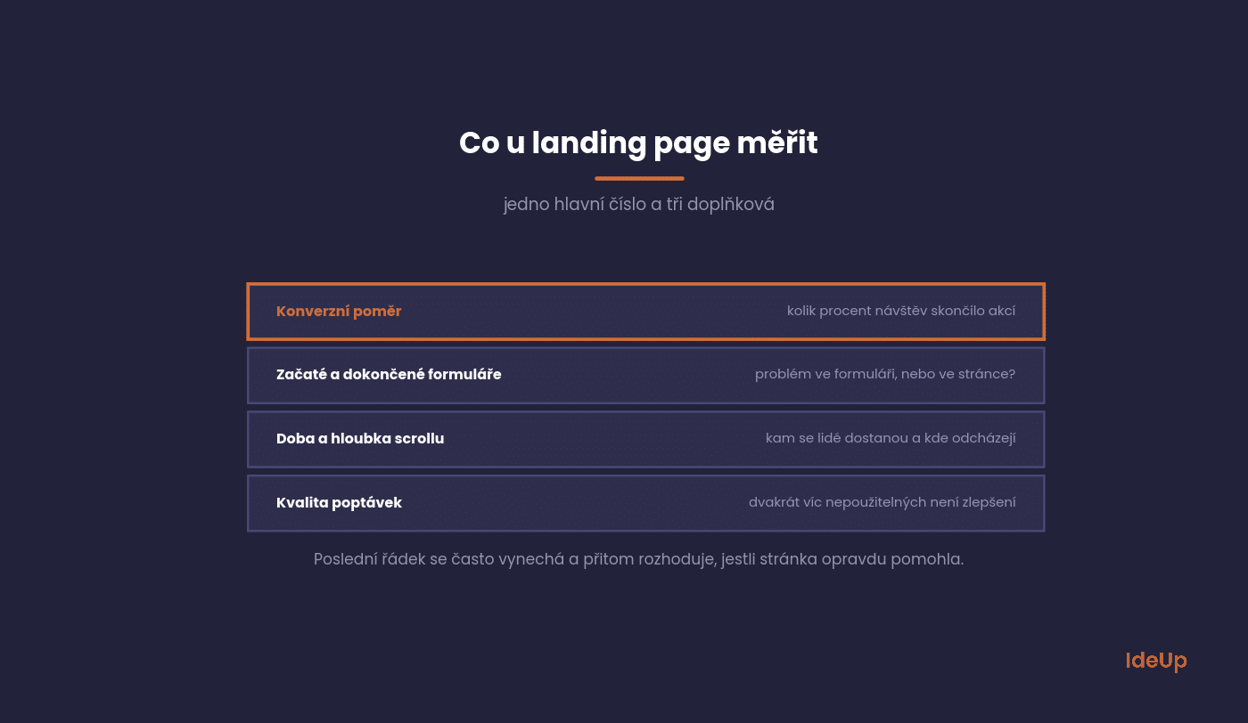
Conversion rate. The percentage of visits that ended in the action. We cover it in more detail under conversion rate.
Ratio of started to completed forms. If people start but do not finish, the problem is the form, not the page.
Time on page and scroll depth. Shows how far people get and where they leave.
Enquiry quality. The number people forget. A page that produces twice as many unusable enquiries has not improved.
Landing page optimisation through testing
Measuring tells you how the page performs. Testing tells you why. The usual method is an A/B test, where half of the visitors see the current version and half see a version with one change.
Start with the elements that have the biggest effect: the headline, the offer itself and the form. Button colours and small wording changes rarely make a visible difference on a page with modest traffic.
Common mistakes are ending a test after a few days because one version looks better, changing several things at once and judging the result only by the number of submissions. Keep a simple log of what you tested and what happened, so you do not repeat the same experiments a year later.
What to avoid
These are the mistakes we see most often on Czech landing pages.
All of them can be fixed in a single afternoon.
A full menu at the top. You offer ten exits from a page you paid a click to bring people to.
A headline about the company. Visitors do not care who you are. They care what they will get.
No proof. A claim without a testimonial is just a claim. Your competitors claim the same.
Slow loading. On a page paid for by advertising, every second is a direct cost. This is linked to website speed.
Common questions
The five questions we are asked most often when building campaigns.
The answers apply in general; for a specific offer, the numbers will differ.
How long should it be?
Long enough to answer every objection. For a cheap, well-known offer, one screen is enough; for an expensive service, it may take ten.
A longer page does no harm if it is well structured. What does harm is a page where people have to search.
How many should I have?
Ideally one per campaign or segment. If you are targeting two different audiences, two pages usually beat one generic page.
But do not create them faster than you can maintain them. An outdated page with an expired offer does harm.
Ideally a logo without links and nothing else. If you are worried about credibility, add contact details and terms and conditions to the footer.
This is easy to test, because the difference in conversion rate tends to be significant.
What is a good conversion rate?
For B2B enquiry forms, it is typically in the single-digit percentages; for simple actions such as downloading a file, it tends to be considerably higher.
Compare yourself mainly with your own results over time. Someone else’s benchmark knows neither your offer nor your traffic source.
Is a page builder enough?
For most campaigns, yes. Content and structure matter, not the technology.
A custom solution only pays off when you need integration with internal systems or many variants.
Where to start
Open the page your most expensive ad leads to and go through the first five seconds. Would a visitor without context understand what you offer and what to do?
Then check whether the page has at least one specific piece of proof. Most Czech pages have none, and adding it is the quickest improvement you can make.
Need a page that ties in with both your campaign and the rest of your website? We build websites as well as individual campaign pages. Get in touch via Contact.
Frequently asked questions about landing pages
What is a landing page?
A landing page is a standalone page built for one specific action, such as sending an enquiry or registering for an event. Visitors usually arrive from an ad, an email or another campaign. Unlike a regular website page, it removes navigation and other options so the visitor can focus on that single action.
What is the anatomy of a landing page?
A typical landing page consists of a headline and subheadline, a visual, benefits, proof, answers to objections and a call to action. The headline and the call to action are essential, the rest depends on how complex and expensive the offer is.
How do you build a landing page?
Start by defining one goal and one audience, then write the text so it matches the ad or email that brings people in. Design the page for phones first and test the full path from the click to the arrival of the enquiry. After launch, measure the results and improve one element at a time.
What do high converting landing page examples have in common?
They have a clear headline aimed at a specific audience, one visible call to action and at least one concrete piece of proof. They also ask only for the information they really need and load quickly on a phone.